B2B Landing Page Anatomy for Google Ads Traffic
Dedicated landing pages beat homepages when Google Ads traffic converts faster.
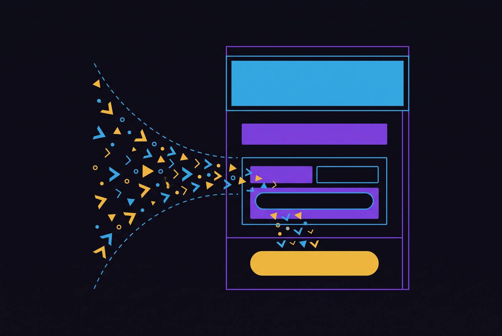
Most companies send paid traffic to their homepage. That's the default setting, and it's the wrong move almost every time. A homepage has to serve everyone at once: job seekers, investors, existing customers, and the cold prospect who just typed a problem into Google thirty seconds ago. Trying to please all of them means the page speaks clearly to none of them.
A landing page follows a different brief: one visitor type, one intent, one action. That's the entire design spec. It's also the reason a dedicated page will beat a homepage for paid traffic, no contest, every time the comparison gets tested.
Why does this matter more now than it did five years ago? Google's Smart Bidding, Target CPA, and Target ROAS are AI bidding products that handle bid adjustments and pattern-finding automatically. The algorithm works at a speed and scale no person ever could. So where's the leverage left for the advertiser? Not in the bidding. In what the traffic lands on.
Doubling a page's conversion rate does the same job as cutting cost-per-lead in half, without touching a single bid. A landing page redesign is a media efficiency project that happens to involve a designer, and treating it as a design afterthought instead of a budget lever is the mistake most Google Ads accounts are quietly making right now.
Message match: the structural connection between the ad and the page
Message match is the degree to which a landing page headline mirrors the exact ad copy or search query that brought the visitor there. It sounds like a small detail. Treating message match as cosmetic raises cost directly, and the effect is visible on the invoice.
Landing page relevance feeds directly into Google's Quality Score. Higher relevance means a lower cost-per-click on that keyword. Message match is a lever on the media cost itself, before it ever touches conversion rate.
Picture the visitor's side of it. Someone clicks an ad that says "Free Website Audit for B2B Companies." They land on a page headlined "Digital Marketing Services." That's a break in continuity landing at the exact second the visitor is most primed to act. Was this the right link? The mental thread snaps, and that half-second of doubt costs conversions.
Most B2B buyers start their search on Google, and that first click, and the page it lands on, is often the very first impression a company makes. There's no warm-up round for this. The message match either holds or it doesn't, right there, in the first three seconds.
The above-the-fold section: what every visitor sees in three seconds
Most visitors never scroll. That means the section above the fold isn't just the most important part of the page. Statistically, for a lot of traffic, it's the only part of the page. Everything below it is optional content seen by a shrinking slice of people.
So what does that section have to pull off, all at once, in about three seconds?
- Name the visitor's problem
- Show the solution, clearly
- Establish some baseline credibility
- Point to one single next action
Four jobs, one screen. Here's how the components split the work.
The headline has to be outcome-driven, not clever. Say what the company does and who it's for, in plain terms. A strong headline swap, on its own, can move conversions meaningfully, an outsized amount of leverage sitting in one line of text. So many pages get it wrong by chasing memorable instead of clear.
The sub-headline carries the specificity the headline can't. It narrows the audience, filters out visitors who aren't a fit, and should read in about five seconds flat.
The primary call-to-action has to be impossible to miss. Contrast does more for CTA visibility than color choice does, and phrasing changes click-through rates as well. First-person copy ("Get My Free Demo") tends to beat second-person copy ("Get Your Free Demo"). Small wording shift, real behavioral difference.
A trust signal near the CTA answers the question nobody says out loud: can this be trusted? A client logo strip, a star rating with a review count, one specific proof stat. Any of these works. Skipping all of them doesn't.
What shouldn't be up there: navigation menus, secondary offers, company history, a full feature list. Every one of those competes for the highest-value real estate on the page. If it doesn't move the visitor toward the one action the page exists for, it doesn't belong above the fold. Full stop.
The value proposition block: translating what you do into why the buyer should care
The headline grabs attention and proves relevance. The value proposition block has a different job: earn the next thirty seconds by making the benefit concrete.
Test it with one question: can the value proposition be understood and found convincing in under 30 words? If it takes longer, it's a feature list dressed up as a benefit statement, and that's the single most common way this block fails.
B2B buyers skim. They don't read a landing page the way they'd read a memo, so the value proposition needs to speak in outcomes, not capabilities. "Cut time-to-close by weeks" lands. "Includes a customizable dashboard with 12 integrations" does not, at least not in this slot. Save the dashboard for later in the page, if it needs to show up.
Three to five short, specific, scannable proof points sitting right under the value proposition bridge the gap between the big promise in the headline and the detailed evidence further down. Think of them as a down payment on credibility. The full case comes later. This is just enough to keep the visitor reading.
Social proof: the hierarchy of evidence and where each type belongs on the page
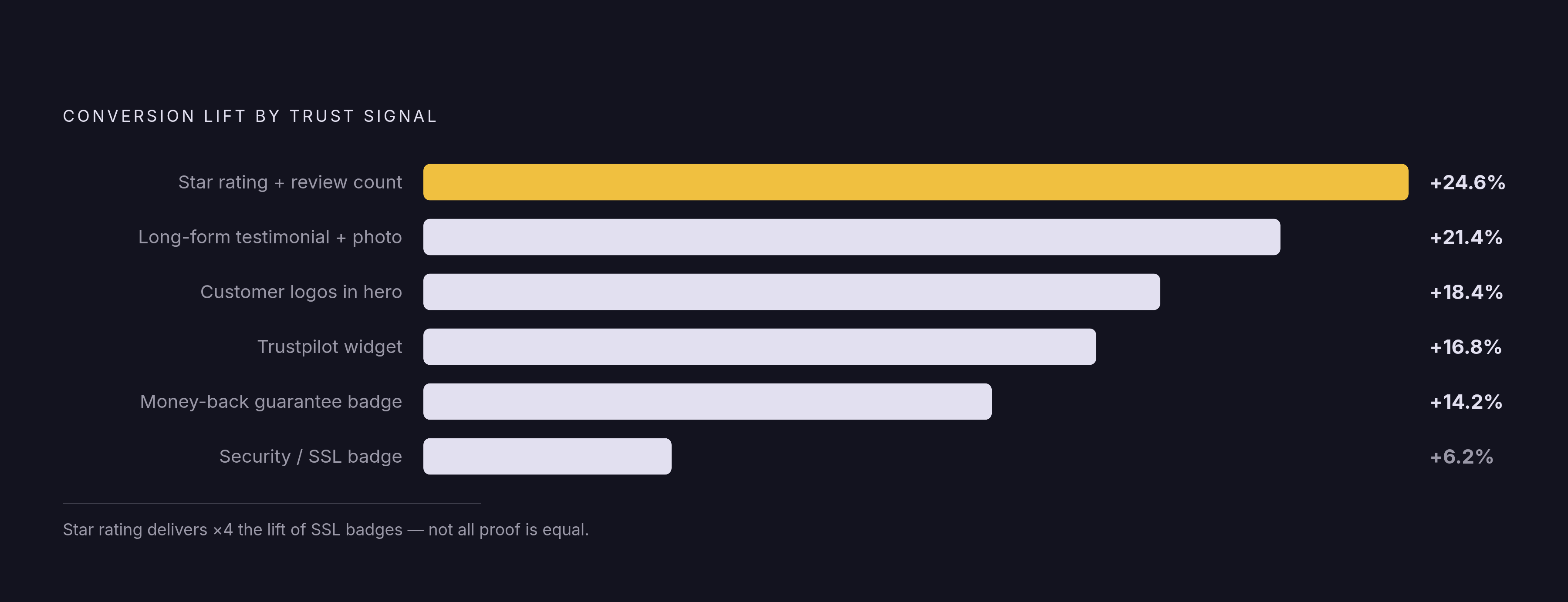
Not all proof is created equal, and treating it that way is where a lot of pages waste their best real estate on their weakest signal. Ranked from strongest to weakest for B2B conversion:
- Case studies with specific, named outcomes
- Named video testimonials
- Named text testimonials with photos
- Client logos with recognizable names
- Industry certifications
- Review platform ratings (Google, Clutch)
- Generic star ratings
The individual lift numbers back up that order:
- Star rating with review count: +24.6%
- Long-form testimonial with photo: +21.4%
- Customer logos in the hero section: +18.4%
- Trustpilot widget: +16.8%
- Money-back guarantee badge: +14.2%
- Security/SSL badges: +6.2%
Notice the drop-off at the bottom. SSL badges barely register anymore, because they've become table stakes. Everyone has one, so it stops signaling anything. Trust signals lose impact as they become universal, when every page carries the same badge, it stops signaling anything distinctive, and a page that leans on the weakest signals is betting on proof that barely registers.
Put the highest-leverage signals above the fold or right next to the CTA. Push the weaker ones (certifications, SSL badges) lower on the page, where they can still do quiet work without hogging premium space.
For enterprise buyers specifically, security and compliance carry real weight. SOC 2 Type II, GDPR compliance, and SSL certificates answer a specific fear: what happens to our data? They aren't decorative. Compliance badges placed near the CTA can lift conversions by 10 to 20% because they neutralize that objection before the prospect has to raise it out loud.
The form: field count, friction, and the tradeoffs B2B teams face
Forms are where a lot of otherwise good landing pages quietly fail. The data is blunt: three-field forms convert at a rate roughly 25% better than nine-field forms. Every field removed is a measurable gain. Every field added is a measurable cost. There's no ambiguity here, and yet forms keep growing anyway.
Why? Because sales wants qualification data upfront: company size, budget, role, timeline. Marketing wants conversion rate. Those two goals pull in opposite directions on the same form, and most teams resolve the tension by adding fields to make everyone happy, which ends up making nobody happy and the conversion rate worse.
The fix most teams skip is progressive profiling: capture the bare minimum at the point of conversion, then enrich that record downstream through the CRM or through intent signals gathered later. The form doesn't need to do all the qualification work in one shot, and asking it to is what tanks the conversion rate. Sales gets its data eventually. It just doesn't get it on the form.
Multi-step forms split the difference. Ask one or two low-commitment qualifying questions first, then ask for contact details once the visitor is already invested in finishing. Small psychological trick, real effect, because people are more willing to complete something they've already started than to start something new.
A growing share of B2B buyers would rather not deal with a sales rep before they're ready, which is part of why embedded calendar booking has become a real alternative to the static form. It skips a step. Instead of "submit form, wait for a callback," it's "pick a time, done." That shortens the gap between deciding to convert and actually having a meeting on the calendar.
Page load speed and mobile experience as conversion variables, not technical afterthoughts
Load speed gets filed under "IT issue" in a lot of organizations. Wrong file. Load speed is a conversion variable, sitting directly downstream of the media budget that was just spent to get someone to the page.
Fast load times are directly associated with better-performing pages, across devices. Slow load times make the page bleed conversions before the headline, the value proposition, or the trust signals ever get a chance to do their job. None of the anatomy covered so far matters if the page hasn't finished loading.
Mobile isn't optional at this point. A meaningful, growing share of B2B research happens on a phone, and a page that looks great on a laptop but breaks on a phone is quietly throwing away a chunk of the traffic it paid to acquire, no matter how sharp the copy is.
What mobile-ready actually looks like, in practice:
- Form fields sized for a thumb, not a mouse cursor
- CTA button positioned where a thumb can actually reach it
- Headline and hero image stacking cleanly, no horizontal scroll
- Load time tested under real mobile network conditions, not just office WiFi
Testing only on WiFi hides exactly the problem that costs the most conversions. A page that loads fast on a fiber connection in an office can crawl on a phone with a spotty signal in a parking lot, and that's the version of the page most advertisers never actually see before it goes live.
Conversion rate benchmarks: what the numbers mean for a B2B program
The average B2B SaaS visitor-to-lead conversion rate is somewhere between 2 and 5%. Top performers reach 8 to 15%. That's a wide range, and the gap inside it tells the real story.
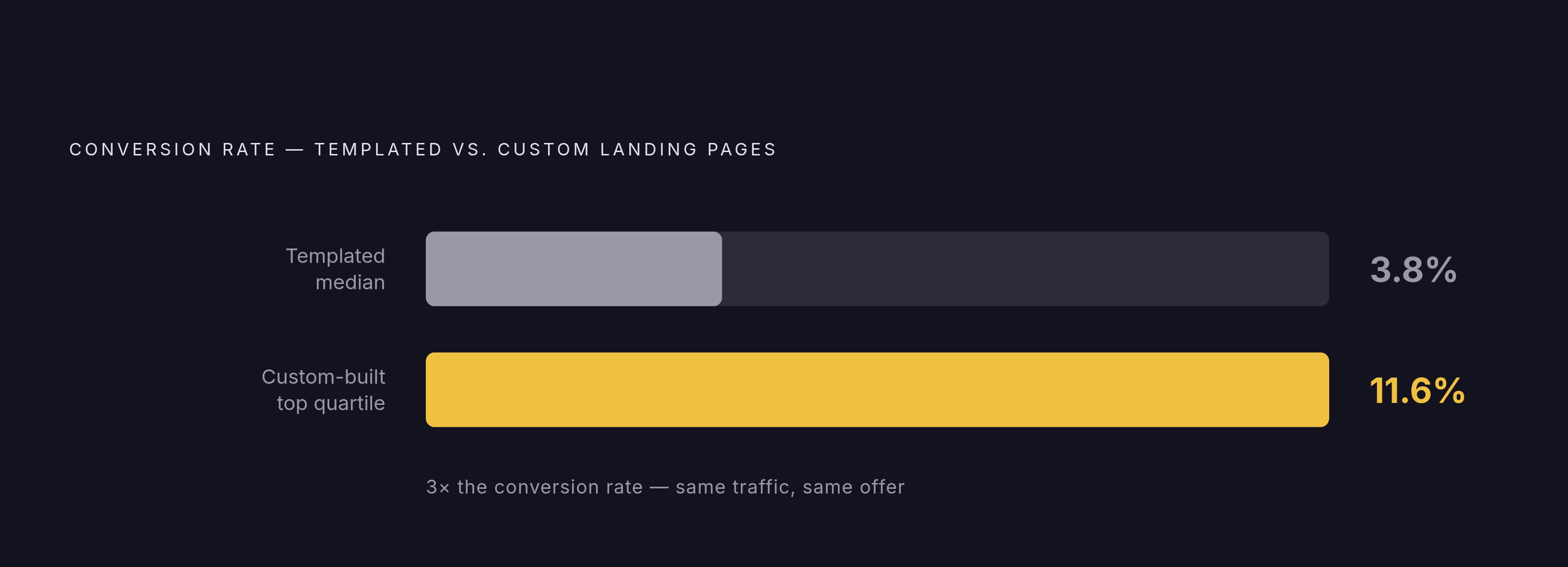
Median is around 3.8%. Top quartile is around 11.6%. Nearly triple, and none of that gap comes from a bigger budget or a smarter bidding strategy. It comes from execution: message match, form design, load speed, proof placement, stacked together. That's the practical upside sitting on the table for anyone willing to fix the anatomy of the page instead of just running more ads to it.
For a dedicated, single-goal page getting genuinely qualified traffic, 10% or higher is a realistic target, not a fantasy number.
Custom-built pages convert at around 11.6% in enterprise data, versus 3.8% for templated pages, triple the rate off the same traffic and the same offer. Custom-built pages convert at around 11.6% in enterprise data, versus 3.8% for templated pages, which is triple the rate, not a rounding error. That's triple the rate, off the same traffic and the same offer. For any program spending a meaningful amount on ads (the data points to $10,000 or more as the threshold where this math works out), the cost-per-acquisition improvement from a custom page tends to cover the design investment on its own.
The connection between the page's conversion data and Google's bidding algorithm
Everything above loops back into the bidding system. Smart Bidding learns who the best prospects are from the conversion signals the advertiser feeds it. The algorithm doesn't know what a "good lead" looks like on its own. It only knows what gets marked as a conversion.
So if a landing page converts unqualified visitors at a high rate, that's exactly the signal being sent back to Google. The algorithm can't distinguish a great lead from a form-fill from someone who was never going to buy. It just sees "conversion" and goes looking for more people who look like that visitor. If it is fed garbage, it optimizes toward garbage with total confidence.
Advertisers treat the landing page as a conversion device and stop there, when it's also acting as a filter, whether anyone designed it to or not. A page with sharp message match, a qualifying sub-headline, and a form that asks the right, minimal questions doesn't just convert more people. It converts the right people, and that shapes who the algorithm chases next. Get the anatomy wrong, and the bidding system optimizes, diligently and efficiently, toward exactly the wrong audience, and it will do it well.